
The Bag and Checkout journey
Summary

The Challenge
Our primary objective was to enhance user engagement, eliminate friction, and ultimately drive higher conversion rates and average order value.
To achieve this, a full review of the Basket and Checkout was necessary to:
- Identify key issues and friction points that negatively impacted user engagement and prevented users from progressing smoothly through the funnel
- Remove barriers that could deter users from completing their purchases
- Optimising content hierarchy and relevance to support user decision-making and encourage higher-value transactions
This challenge was further complicated by the complex nature of Dune London's product offerings, including:
- Products with different fulfillment eligibility (e.g., items available for home delivery vs. store collection)
- Staff purchases with specific pricing and restrictions
- Other complex purchase conditions requiring flexible and inclusive UX solutions
Solving these challenges required a strategic, user-centered design approach that balanced business goals with the nuances of product types, fulfillment logic, and varied user scenarios.

My Role
I led the redesign process, managing the full design lifecycle from strategy to execution. This included:
- Collaborated with third-party CRO to identify key optimisation opportunities
- Led co-creation and brainstorming workshops with stakeholders
- Oversaw wireframe development and user testing to validate design decisions
- Designed and delivered the final design prototype
- Built A/B tests using Monetate to measure impact and inform iterations
- Worked closely with developers to ensure a seamless design implementation
Design Process and Approach
To deliver a seamless checkout experience and improve conversion rates, we followed an iterative, user-centred process rooted in insight and collaborative design. Our approach included five key phases:
- 1 Discovery & Data Analysis
Identifying key issues and gathering insights from analytics and research. - 2 Ideation and Conceptualisation
Defining the new experience based on findings and user journeys. - 3 Design The Experince
Creating and validating wireframes and prototypes. - 4 Testing and Validation
A/B testing, usability testing, and iteration based on feedback. - 5 Implementation & Iteration
Rolling out changes and continuing to optimise based on live data.
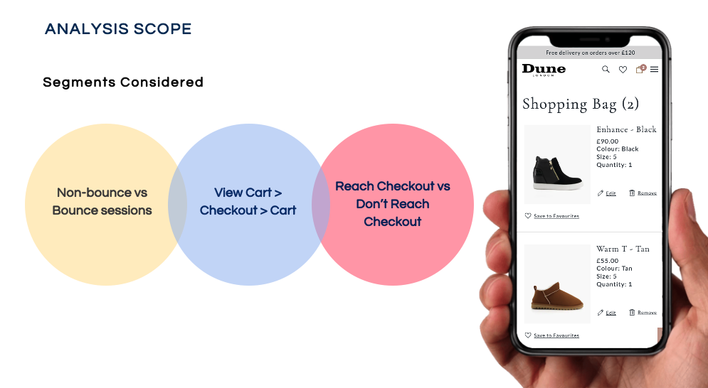
Key User insights and pain points
The project was kicked off by conducting an in-depth review of user behavior in different user segments with a focus on mobile devices users, using a range of methods and tools.
This analysis was crucial in identifying key blockers and uncovering opportunities to improve both conversion and user satisfaction, particularly on mobile, where drop-off rates were the highest.
Behavioural Patterns
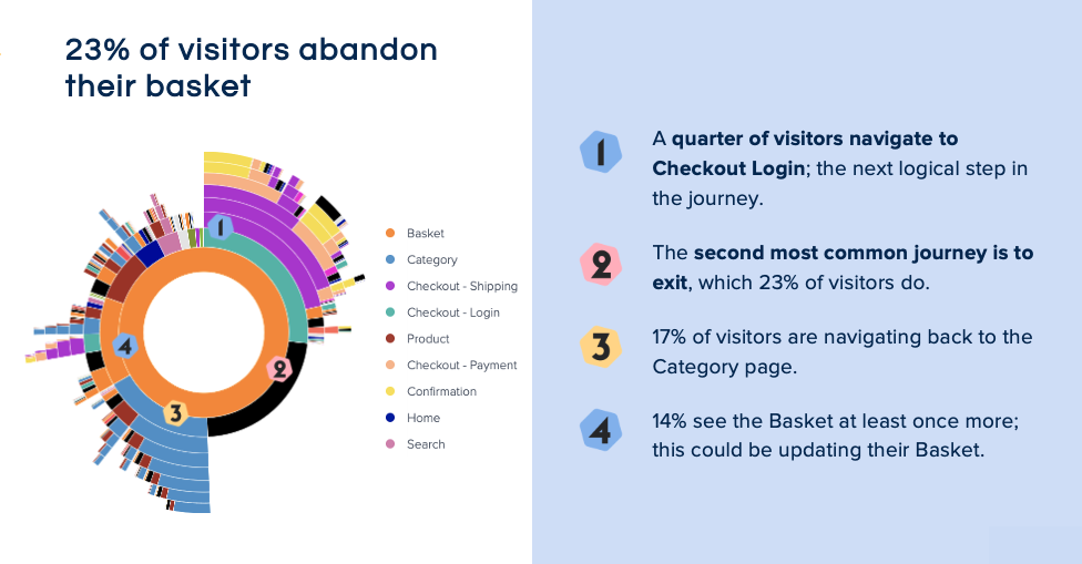
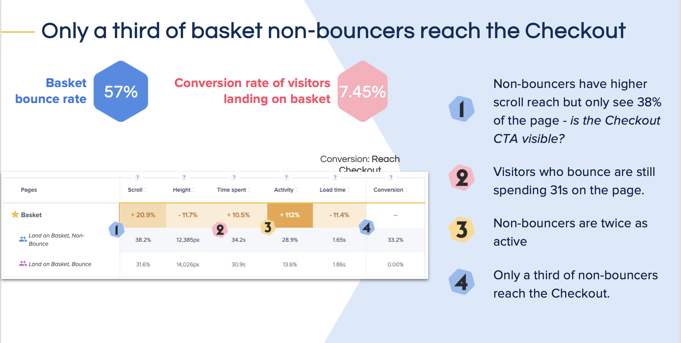
The collected data revealed, recurring behavioral patterns and friction points highlighting users bounce and looping behaviors.
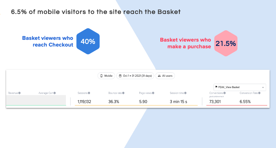
- Only 25% of users who visited the Basket proceeded to Checkout
- 14% of users who navigated to Checkout looped back to the Basket
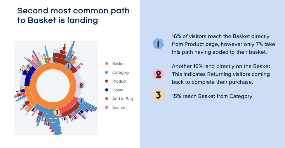
- 17% of visitors returned to Category pages from the Basket page
- 23% of users who navigated back to Category pages abandon their Basket entirely
These metrics highlighted a lack of clarity and confidence in the user journey, suggesting that users were either uncertain about how to proceed or lacked essential information to complete their purchase.
Usability and Accessbility issues
We also conducted a usability audit across the following key areas and all related user flows to identify opportunities for improvement and to address any critical issues.
- The Basket page
- Checkout login page
- Shipping section
- Payment section
- Order confirmation
The evaluation uncovered several issues that were contributing to user bounce and looping behaviour. These included:
- Missing or unclear information: Key messages about delivery, returns, and item eligibility were often hidden or not displayed at all, preventing users from making informed decisions and committing to purchases.
- Poor content and information hierarchy: The structure and wording of headings, form fields, and steps to capture user data were unclear and poorly organised, making the process confusing.>
- Limited user control: Users were unable to edit items or quantities within the Checkout flow, forcing them to restart the journey from the Basket, which led to frustration and abandonment.>
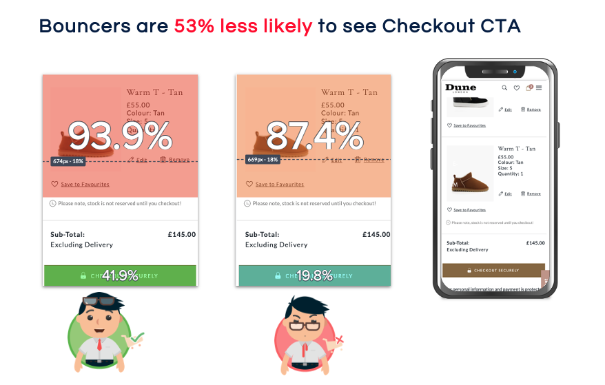
- Mobile-specific issues: On mobile devices, users experienced limited visibility of key elements such as the Checkout call-to-action (CTA) and Order Summary, impacting the overall experience and increasing drop-off rates.>
Mixed Product Edge Cases
During the evaluation, we also identified specific barriers affecting users with mixed items in their Basket, which prevented them from progressing to the next steps and completing their purchase.
- Items ineligible for collection
- Items not eligible for discounts
- Items that could not be delivered to certain Postcode locations
There was a lack of timely notifications and contextual alerts to inform users about these conditions and any required actions, leading to confusion and last-minute abandonment.

Defining the new concept
Following our discovery phase, we began shaping the new experience. Our aim was to reimagine the end-to-end journey, resolving user pain points, enhancing usability, and aligning with business goals.
To ensure the experience worked accommodated all customer types and edge cases, we first mapped out the key scenarios that the new design needed to support:
- Guest users (both delivery & collection)
- Registered users (both delivery & collection)
- Mixed item baskets
- Staff purchases
- Delievry of Products sourced from Stores
This approach ensured all critical information and processes were accounted for, resulting in a flexible experience that supports seamless journeys for every customer.

Best Practices
To inform and inspire the new design, we carried out a best practice audit and competitor analysis, focusing on:
- Key fashion and retail competitors: reviewed user journeys and checkout flows
- Industry trends: identified features that improve conversion and reduce friction
- Usability and accessibility: applied standard guidelines and best practices to enhance user experience
This research highlighted opportunities for Dune London to stand out while staying aligned with user expectations.

Collating Ideas
Using insights from discovery and research, we ran brainstorming sessions with internal stakeholders to identify design improvements that address key user pain pointsthe Basket Page and Checkout Journey.We outlined actionable, high-impact changes for each area.
Basket Page Enhancements
- Persistent delivery, collection, and returns information
- Sticky Checkout button for mobile
- Real-time alerts (e.g. collection restrictions)
- Editing capability (quantity, size, colour, remove, add to wishlist)
- Retargeting messaging for saved baskets
- Improved product recommendations with better placement
- Save for later option for undecided users on the Basket Page
Checkout Flows Enhancements
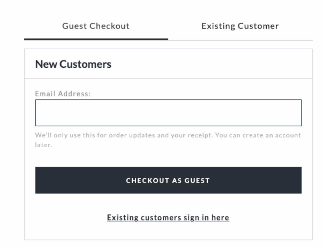
- Redesign Checout entry (login) page
- Progress bar showing clear Checkout stages
- Streamlined form layout with logical flow
- Clear and consistent headings in correct order
- Improved mobile Order Summary visibility
- Visual alerts for disqualified/mixed items
- Retained form data during flow transitions
- Inclusive and WCAG-compliant components
- Better and meaningful error provention messages
- Enhanced order confirmation page and emial
Designing the final experience
With a clear direction established in the previous phase, we began translating concepts into tangible design outputs.
We adopted a mobile-first strategy, ensuring all designs were fully responsive. , inclusive, and WCAG-compliant from the outset. Starting with wireframes, we rapidly iterated and gathered feedback to inform our approach. These evolved into high-fidelity prototypes, optimised for both mobile and desktop experiences.
Accessibility Enhancements
Accessibility and clarity were prioritised throughout the design process. From layout choices to interaction patterns, we ensured an inclusive experience for all users by embedding accessibility best practices at every stage.
Some key examples include:
- High-contrast text and large tap targets
- Full keyboard navigation with clear focus states and no focus traps
- Correct and logical information hierarchy
- WCAG-compliant components including inteactive elelements and forms
- ARIA support for screen readers
Basket Page Redesign:
Checkout Process Redesign:
Mobile Optimisation Features
Given the high volume of mobile traffic, we prioritised specific enhancements to improve mobile usability and overall user experience. Key improvements included:
- Ensured visibility of critical components to support quick decision-making and task completion
- Progressive disclosure to reduce cognitive load by revealing information gradually as needed
- Smart scroll positioning and fixed key CTAs o maintain context and keep essential actions within reach
- Breakpoint-specific enhancements
Test and Validation Approach
To ensure our solutions were effective and user-centric, we adopted a two-pronged validation strategy combining A/B testing and usability testing. This mixed-methods approach enabled us to measure performance in real-world environments while capturing user insights.
- Basket Page A/B Testing
- 7% uplift in conversion within the first coupel of weeks
- Significant reduction in bounce and loop behaviours, indicating smoother user journeys
- Higher user engagement and positive feedback on the improvements
- Checkout Journey Usability Testing:
- Participants: Mix of new, returning, and guest shoppers
- Devices: Mobile-first focus, with secondary testing on desktop
- Scenarios Tested: A mix of both happy and unhappy paths
- Refined alerts messaging and form validation guidance
- Improved spacing on smaller mobile devices
- Clarified discount/eligibility rules messaging for restricted products
- Strengthened back-navigation patterns to reduce dead-ends or confusion
- Alignment on priorities and scope based on team velocity
- Adapt to technical constraints without compromising UX
- A continued focus on business goals
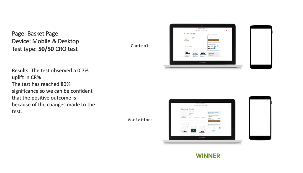
- The Basket page achieved a 7% uplift following the A/B test rollout, and conterbuted to a remarkable overall 30% increase in conversion rate, exceeding initial projections..
- There was a significant reduction in bounce and looping behaviour, particularly on mobile devices
- Average Order Value improved, supported by clearer information and more effective recommendations
- Checkout usability tests recorded a 98% user task success rate, confirming the ease of completing critical actions
- The phased approach to the Checkout redesign was validated through live testing and incremental rollout, enabling safe iteration and continuous optimisation
- Strong cross-functional alignment across CRO, product, UX, and development teams ensured priorities remained focused on both user experience and business goals
- Strategic UX leadership and cross-functional collaboration
- Designing for complexity across edge cases and mixed user states
- Balancing user needs with brand and commercial priorities through iterative design and testing
To measure real-world impact, we conducted a live A/B test on the site with a 50/50 split. Results showed clear, measurable improvements:
For the Checkout redesign, we conducted moderated remote usability testing using high-fidelity interactive prototypes.

Refinements Based on Feedback
Implementation & Iteration
This phase underscored the strength of stakeholders collaboration across UX, CRO, product and development. Following regular syncs, paired design-dev reviews to:
We adopted an iterative approach with a phased implementation strategy, splitting the new Basket and Checkout experiences into distinct sprints. Features and flows were prioritised based on impact, complexity, and technical dependencies. This approach helped manage risk, validate improvements incrementally, and maintain momentum across teams.
Phase 1: Basket Page Rollout
The redesigned Basket experience was implemented across mobile and desktop over two sprints. Due to its high impact, the first phase was fully A/B tested and then rolled out site-wide following positive results.
Phase 2: Checkout Journey Rollout
GDue to its complexity and higher risk, the Checkout redesign is being rolled out in multiple sprints, with the work still in progress. The journey has been broken down into manageable components, prioritised by impact, complexity, and technical dependencies. This phased approach enables real-time monitoring, incremental validation, and continuous improvement throughout the rollout.
Continuous Monitoring & Optimisation
To support ongoing iteration post-launch, we implemented a robust monitoring framework with real-time dashboards via Google Analytics and ContentSquare enabling the team to closely monitor performance metrics, quickly surface bugs and drop-offs early, evaluate changes, and uncover new optimisation opportunities.
Outcome and Key Achievements
During discovery and conceptualisation, we identified key usability issues and opportunities to enhance the Basket and Checkout experiences. We anticipated that addressing these challenges through targeted design improvements would drive meaningful gains in conversion and user satisfaction. Post-launch results have validated these expectations, showing sustained improvements over time.
Key Outcomes
These outcomes demonstrate that data-driven, user-centred design—grounded in deep insights and rigorous testing—can meaningfully improve both customer experience and business KPIs.
Personal Contribution
Leading an end-to-end redesign process from discovery through to rollout was a rewarding challenge. With strong collaboration from the wider team, this work sharpened my capabilities in:
I'm proud of what we achieved as a team, and confident that this work laid the foundation for continued CRO gains and a more user-centric culture at Dune London.