
Hive Application Design
Summary
The Challenge
HiveMind’s mission is to help client businesses transform and grow through specialised expertise. To deliver this, internal users needed fast onboarding, seamless communication, effective collaboration, and clear visibility into business cases.
However, as HiveMind grew, its internal tools didn’t scale. The team relied on loosely connected open-source tools accessed via an outdated internal site.
This fragmented setup led to several challenges:
- Disjointed communication across projects and teams
- Poor task tracking and limited visibility into progress
- Lack of a centralised hub for documentation and knowledge sharing
- Collaboration friction, reducing user engagement
- Usability and accessibility issues

Statement of Intent
This project aimed to unify HiveMind’s fragmented toolset into a seamless collaboration app, empowering internal users to communicate, collaborate, and manage workloads efficiently in one single place across desktop and mobile.The goal was to create a platform that felt not just powerful and functional, but also:
- Elegant, simple, and easy to use
- Intuitive and user-friendly
- Aligned with HiveMind’s culture of independence, excellence, and shared growth
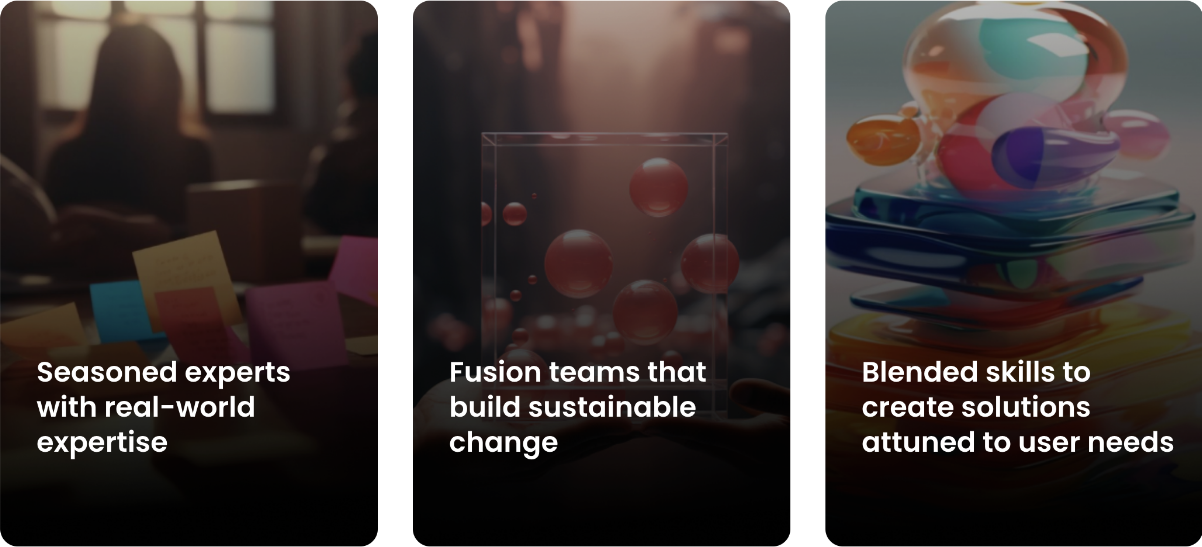
At the core of my design approach was a commitment to human-centred thinking, ensuring the platform met real user needs while supporting the organisation’s broader vision for scalable, sustainable collaboration.
Display a vedio or an image, vedio in the row images
My Role
I was brought on as a consultant to lead the user experience design, working closely with key stakeholders, including the senior management team and CEO. I was tasked with evaluating the existing toolset and designing a fully tailored solution from the ground up. Responsibilities included:
- Audited the existing tools and workflows
- Led user research and turning insights into actionable requirements
- Designed a cross-platform application (desktop and mobile)
- Aligned the design vision with business goals and stakeholder expectations
- Supported the implementation team to maintain design integrity through development
This case study outlines my approached from discovery to delivery and the tangible impact that followed.
My Design Process
I followed an end-to-end design lifecycle, balancing user needs, business goals, and technical feasibility.
My approach centred on building a clear design narrative—grounded in real-world use cases and refined through ongoing collaboration and feedback.
- 1 Discovery & Evaluation
Understanding the problem space through audits, research, and stakeholder input - 2 Ideation & Planning
Defining opportunities and aligning on a strategic direction - 3 Design & Prototyping
Bringing concepts to life through iterative design and rapid prototyping - 4 Testing & Refinement
Validating solutions with users and refining based on feedback
Discovery and Evalation Approach
The first phase of the project focused on understanding the full scope of the challenge, both from a business perspective and through the lens of day-to-day user experience.
It was important to:
- Understand pain points experienced by internal users
- Align with leadership on operational and strategic goals
- Audit the current tools and workflows in use
- Identify opportunities to streamline communication and task management
Stakeholder & Team Engagement
I began with in-depth discussions involving key stakeholders, including senior leadership, operational leads, and the CEO. These conversations aimed to uncover:
- The long-term aspirations for how HiveMind teams should work together
- Current operational bottlenecks impacting performance and delivery
- Priorities for scalability, transparency, and team alignment
It quickly became clear that while the company valued flexibility and autonomy, there was an urgent need for a more consistent and structured digital workspace that reflected those values.
User Research & Tool Audit
In parallel, I spoke with internal users across disciplines to capture the challenges they faced in their daily workflows. Frustrations included:
- The long-term aspirations for how HiveMind teams should work together
- Current operational bottlenecks impacting performance and delivery
- Priorities for scalability, transparency, and team alignment
It quickly became clear that while the company valued flexibility and autonomy, there was an urgent need for a more consistent and structured digital workspace that reflected those values.
Key findings
This phase highlighted several core pain points:
- Fragmented workflows leading to inefficiencies and duplicated effort
- Limited visibility across people, processes, and workstreams
- Inconsistent onboarding making it hard to integrate new users smoothly
- Communication silos reducing alignment and collaboration
The Discovery phase concluded with a clearly defined design brief, aligned with leadership expectations and grounded in user realities. With a solid understanding of the problems, we moved into Ideation & Planning to explore possible solutions.
Ideation and planning
With a clear understanding of the challenges and opportunities uncovered, the next stage focused on shaping a solution that could respond directly to HiveMind’s needs. This was about defining what the application needed to do to upport different types of users.
Defining the Scope
I went through a series of workshops with internal teams to map out desired capabilities.The goal was to ensure the new platform would:
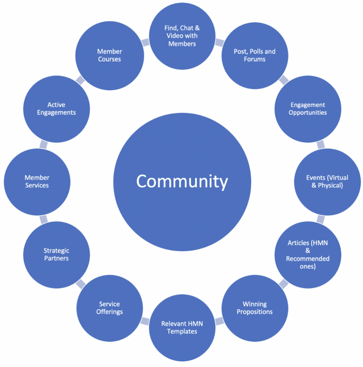
- Centralise communication
- Improve workload management and knowladge share
- Support seamless user onboarding
- Provide greater visibility across teams and projects
- Reflect HiveMind’s identity: independent, efficient, and collaborative
Working closely with stakeholders, I translated insights from user research into a prioritised set of design requirements.
- Personas and Use Cases: To ground design decisions I created personas representing HiveMind’s diverse user base, from operational leads and project coordinators to new users joining the network.
- Journey Mapping: Documented user journeys to identify critical touchpoints and areas where the new application could improve efficiency.
- Competitive & Comparator Research: To ensure the solution would stand up to industry expectations and feel familiar yet unique, I carried out a competitive landscape review.
Concept Development & Feedback
With a well-defined scope and foundational research in place, I began developing early concept sketches and user flow diagrams, translating strategic objectives into possible application structures. I explored different approaches to:
- Dashboard organisation and task visibility
- Communication hubs and shared spaces
- User onboarding pathways
Initial low-fidelity wireframes were shared with stakeholders and select users to gather feedback and refine direction before committing to visual design
Sloution and design
With direction confirmed and early concepts validated, the design phase was about bringing the application to life, not just in how it looked, but how it worked, how it felt, and how it supported the people using it.
Design Goals
The goal was to create an interface that felt elegant and confident, yet simple to navigate. Every screen needed to support clear thinking, encourage collaboration, and reduce noise — whether on a large desktop or a small mobile screen. Just as importantly, the experience needed to reflect HiveMind’s unique working culture: independent, focused, and value-driven.
Designed a sleek and functional interface, prioritizing ease of navigation and usability. Features Included: which seginficantly improved their workload allowing users to comunocate, collborate and manage work all in one place, leading to overwhelming postive feedback.
High-Fidelity Designs
- Brand Alignment ncorporated HiveMind’s branding elements to ensure a cohesive visual identity.
- The Dashboard: A customisable home base showing upcoming tasks, team updates, and quick access to projects.
- Task and Workload Management: Visual task boards, status updates, and progress tracking — helping teams stay aligned.
- Communication Hub: A centralised space for announcements, group messages, and project-specific conversations.
- User Profiles Designed to showcase expertise, published content, and current involvement — supporting discovery and visibility.
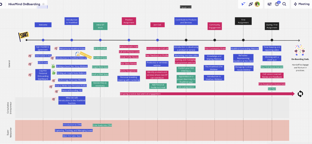
- Onboarding Experience: A guided flow to help new users get started quickly, connect with their teams, and understand how the platform works.
- User Profiles Designed to showcase expertise, published content, and current involvement — supporting discovery and visibility.
- A central communication hub for streamlined discussions.
- Task management tools with prioritization and assignment capabilities.
- A shared document repository for collaboration.
- Adaptive layouts for both desktop and mobile users.
Interactive Prototype and Testing
I built an interactive prototype in Figma to demonstrate the flow and interactions of the application. This was shared with a small group of internal users for usability testing, focusing on:
- Task management and project navigation
- Messaging clarity and communication flow
- Onboarding ease and first-use experience
Feedback was constructive and insightful, highlighting areas to simplify labelling, adjust spacing on mobile, and reduce steps during onboarding. I refined the design iteratively, using this feedback to improve usability and polish the experience.
Stakeholder Presentation
TOnce refined, I presented the high-fidelity prototype to the CEO and senior stakeholders. The response was overwhelmingly positive — particularly around how well the design captured the HiveMind ethos while solving very real day-to-day issues. The clarity of task management and communication tools stood out as immediate value-adds.
With stakeholder sign-off, we moved forward to the build phase with full confidence.

Implementation and Launch
With design fully approved, it was time to bring the platform to life — not just as a concept, but as a working tool the HiveMind team could rely on every day.
- Collaboration with Developers
Worked closely with the development team to translate the design into a functional product and ensure the build stayed true to the design vision. - Iterative Testing:
The focus here was to conducted regular usability but readiness testing during the development phase to ensure quality and alignment with user needs. - Training and Support
To support adoption, I produced a simple onboarding walkthrough and knowledge base for internal teams — with short guides on how to get the most out of the platform. A few quick drop-in sessions helped early users get comfortable and ask questions directly.
Impact and Key Achievements
The application was officially successfully launched, replacing the outdated internal website, with strong early adoption. Within a few weeks:
- Over 70% of users were actively engaging with the platform
- Teams reported better visibility across projects
- Cross-functional collaboration noticeably increased
- Onboarding time for new users dropped significantly
- Feedback was overwhelmingly positive around the clean UI, ease of navigation, and sense of clarity the platform provided
The CEO highlighted the project as a milestone in HiveMind’s operational transformation.
Reflections
TThis project was more than just a redesign — it was a rethink of how a growing organisation like HiveMind could work smarter, faster, and more collaboratively from within. By replacing a fragmented system with a focused, intuitive platform, we helped unlock efficiency and confidence in how teams communicate and deliver.
A few reflections from the process:
- Empathy over assumptions Grounding the design in real user behaviours — through research, personas, and testing — ensured we solved the right problems, not just the obvious ones.
- Clarity drives adoption: A simple, elegant interface helped reduce the learning curve and improve engagement across different roles and devices.
- Collaboration builds trust:Staying close to stakeholders, developers, and users throughout made delivery smoother and outcomes stronger.
- Design is never ‘done’: Even after launch, we continued listening and iterating — something HiveMind valued and embraced as part of their agile mindset.
Ultimately, this was a project that combined strategic thinking, design leadership, and a deep respect for the people who’d be using the product every day.